Devlog 31: Menu Refurbishment
Steel Titans » Devlog
So, whats new?
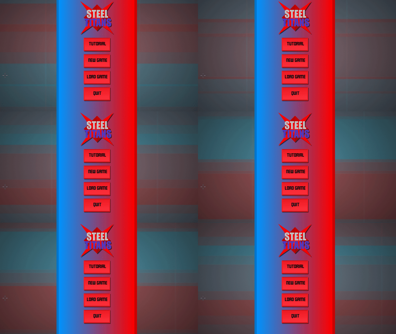
Remade the menu
So at the start of this week, I came to the conclusion that the menu, well, was kinda trash. Not “Needs some work or polish” trash. More of a “Needs a full redo” sorta trash.
So after some work, I got a new menu.
 Not only, do you get fancy, gradients and drop shadows, along with a weird graphic in the backround. You also get….
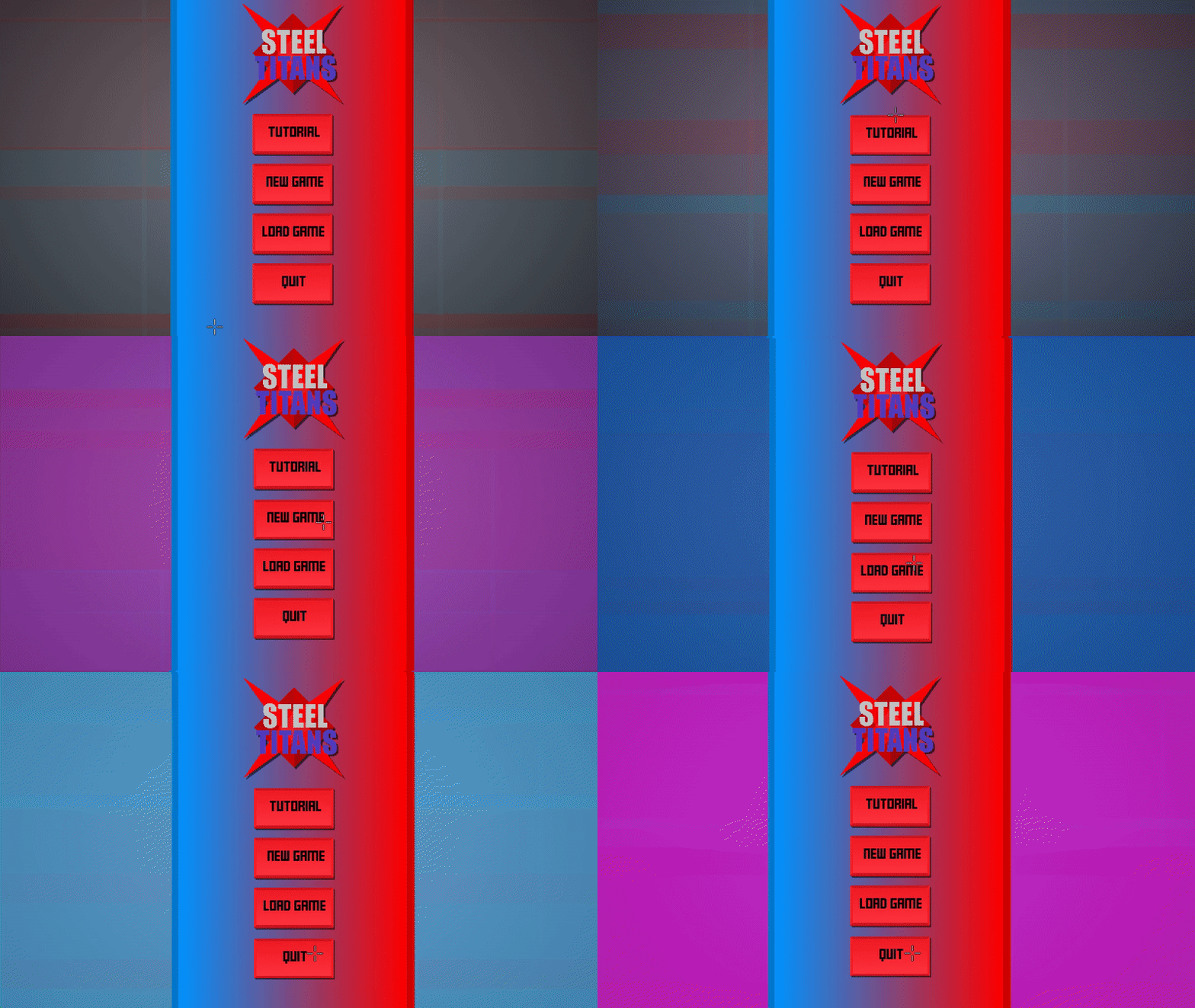
juuuice…
Hovering over the buttons, gives you some lovely screen shake, and changes the colour of the backround. It’s still a work in progess, but its getting there.

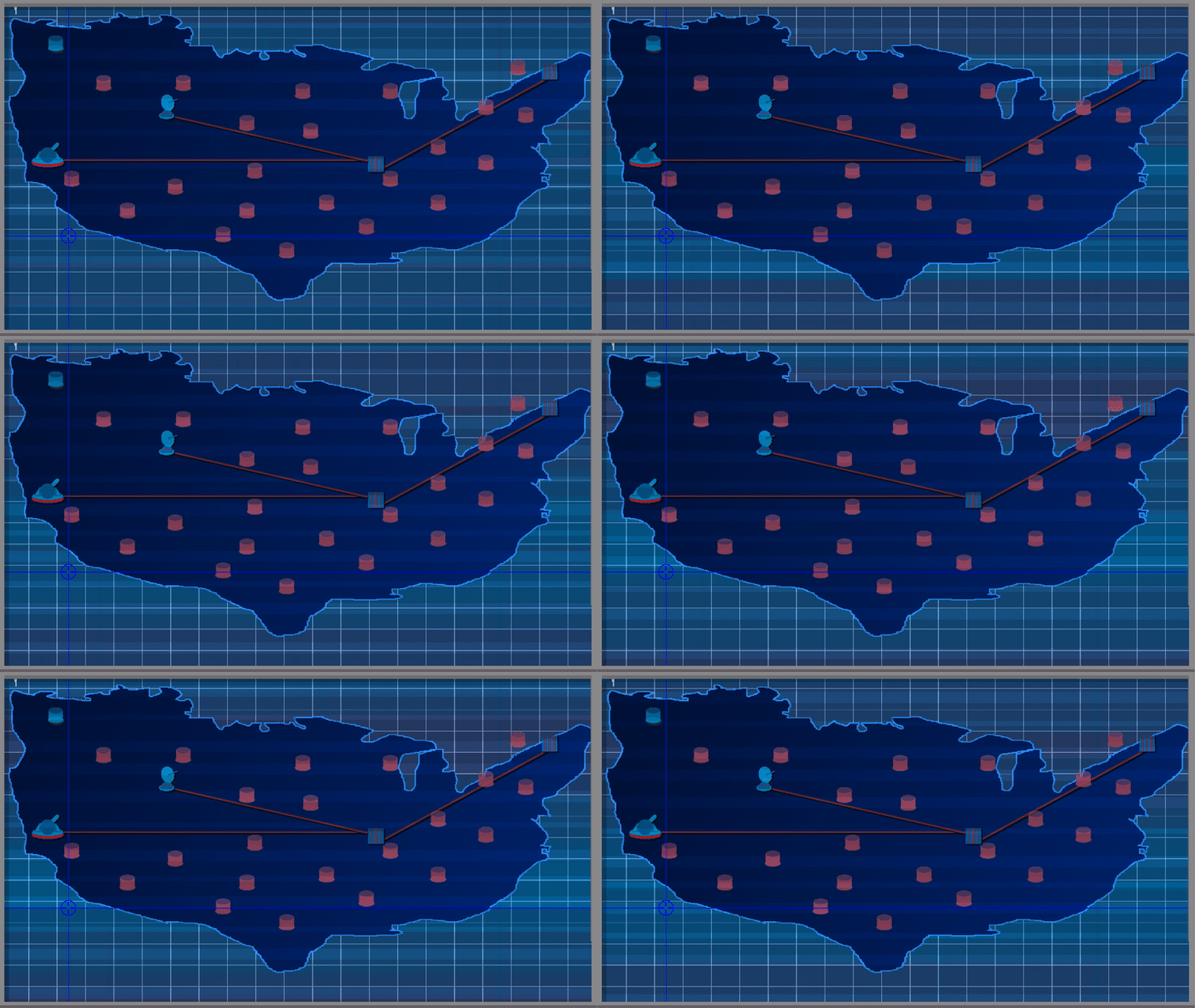
Plus, I’ve added some drop shadows, gradient, and that weird graphic again, to the map screen, which will be my focus next week, probably.

General changes
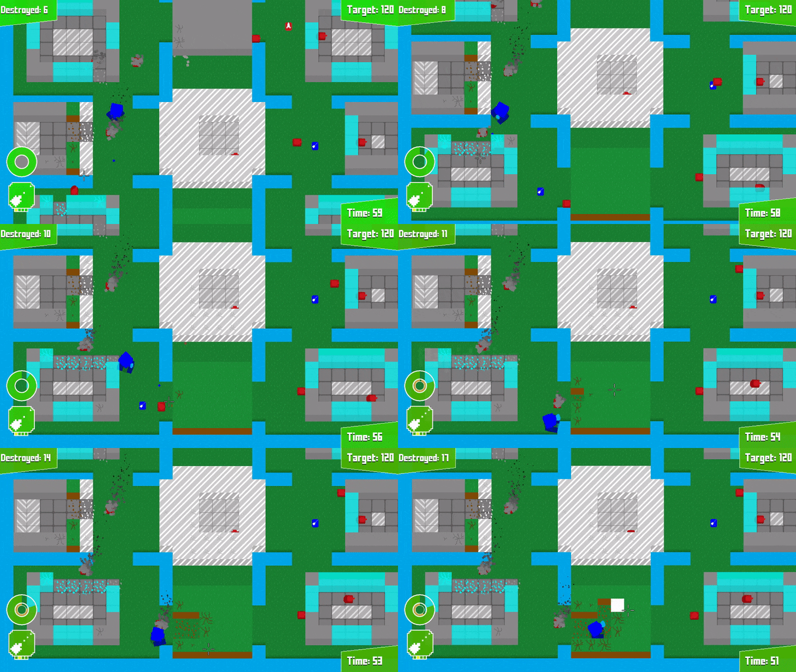
- Water animation varies
- Added detail to grass
- Changed map border
- Fixed map filter
- Added colour to cables
- Fixed concrete slabs being partially transparent
- Fixed returning to menu in tutorial and [REDACTED] leading to dev menu

Thanks for reading!
Get Steel Titans
Download NowName your own price
Steel Titans
Giant robots, Heavy amounts of destruction. Destroy the world.
| Status | In development |
| Author | Squidsheep |
| Genre | Action, Shooter |
| Tags | Arcade, Destruction |
More posts
- No more updatesMay 27, 2019
- Bugfix 1.0.1May 09, 2019
- Steel Titans is out now!Apr 17, 2019
- Devlog 34: The Grand FinaleApr 14, 2019
- Devlog 33: Penultimate PerilApr 07, 2019
- Devlog 32: On the horisonMar 31, 2019
- Devlog 30: New UI + TrailerMar 17, 2019
- Devlog 29: A short oneMar 10, 2019
- Devlog 28: Tutorial + Save Game + New MenuMar 03, 2019

Leave a comment
Log in with itch.io to leave a comment.